Update: Facebook has done away with the 20% text rule for Cover Photos. You do still have to be careful if you’re running ads in the newsfeed though. If you are, then you’ll still want to be within the 20% text rule, as it might still apply.
Facebook has once again made a change to the guidelines for cover photos on your Facebook Page. When Facebook first launched the “Timeline” design for Pages, they decided to make it against the rules to put a “Call to Action” on the cover photo. This was a huge disappointment for a lot of businesses, because a cover photo is prime real estate that can be used to guide your followers to take an action on your Page, such as clicking on a custom tab, Facebook contest, or even getting them to call you. Marketers and businesses were forced to get clever with their “call to action” designs or they designed cover photos for branding purposes only. Now, Facebook has changed the rules again. You can not only put a call to action (such as an arrow with the words “click below to enter our contest”) but you can also add your contact information. Not allowing contact information on a cover photo was also a rule Facebook had.
Awesome! What Kind of Call to Action is Good for a Facebook Cover Photo?
Focus on what you want to promote. Are you running a Facebook or other contest? Are you having a sale? Do you have a newsletter sign up page or other custom app you would like to promote? Honestly, the options are endless here. It all comes down to making a decision and then getting the cover photo designed so that it looks great and your call to action will stand out!
But! There’s Always a But!
However, this change to the Faceboook Cover Photo guidelines also comes on the heels of their earlier change: covers may not include images with more than 20% text. This is a direct quote from their guidelines. So what does this mean? Basically, you can add your contact information and any calls to action you want, but you need to make sure that the information covers 20% or less of your image. For those of you without math or design backgrounds, that’s 1/5 of your photo or less.
What Happens If My Text Covers More Of My Cover Photo?
Good question. If you don’t run any ads on Facebook, the most that can happen, is that Facebook will remove your cover photo. At that point you can have it redesigned and reuploaded. But, if you are running ads on Facebook, you’ll want to make sure that your cover photo plays by the rules. Facebook reviews the ads that businesses make, so the chances of you getting it past the moderators is slim to none. Also, who wants to redesign something in the middle of a campaign (especially if that campaign has a time-limit on it)?
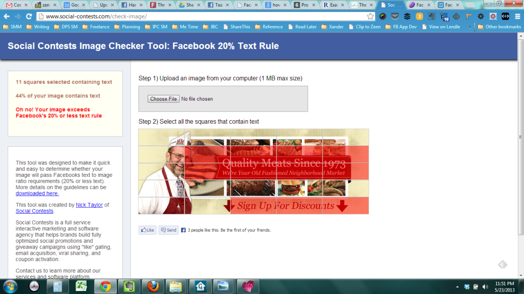
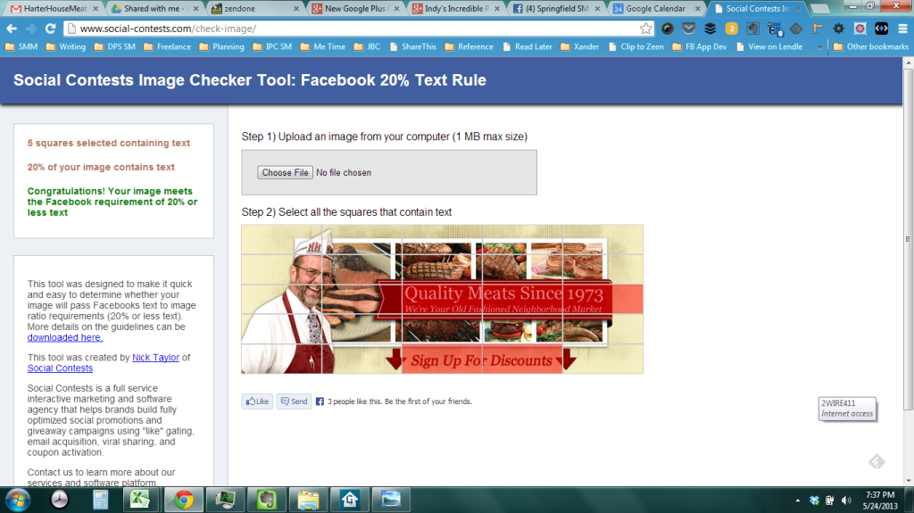
Here’s a great resource that mirrors what Facebook uses to check a cover photo against their guidelines. All you need to do is upload your photo and then click the boxes where the text appears (make sure you click a box even if there’s a tiny bit of text in it). If your text appears in 5 boxes or less, you should be in the clear. If the text appears in more than 5 boxes, you’ll need to adjust the text.
We used this free resource to check a cover photo we designed very recently for a client who wanted to promote signing up to their newsletter. As you can see (in the screenshots below) it has a nice call-to-action near the bottom promoting the newsletter signup. The first picture is a screenshot of us checking the cover photo with the tool and finding out that the text covered too much of the photo. The second picture is a screenshot of us rechecking the cover photo and finding out that it’s now in the clear.
Cover Photo Not Within Parameters
Cover Photo Within Parameters
And Finally!
So, for those of you who want to save a little time, I have a nice resource for you! We created a Photoshop file based on the grid that you see in the online resource. If you use Photoshop, all you need to do is open it up and hide everything except the “Facebook Guides” group. We do also have the guides setup correctly in the file, if you like to use those. Hopefully this resource will save you even more time in determining whether your Cover Photos fit within the 20% rule. You can download this resource by putting in your email address below.
Put in your email address to download the free resource. We hate spam too! We'll only email you if you say we can.
- The Basic System to Rock Any Social Media Platform Part 1: The 3 Phases of Social Media Success - October 26, 2015
- I’m leaving on a jet plane… - August 4, 2015
- UPDATED: Tutorial Infographic: How to Add An Admin to a Facebook Page - June 10, 2015


