One of the easiest ways to get more Facebook Likes for your Facebook Page, is to add the Facebook Like button (targeted at your Facebook Page) to your website.
This is a simple and often overlooked tactic which could result in more Likes for your Page. Why does it work?
Consider these two scenarios.
In the first one, a visitor to your website sees the Facebook icon and is enticed to click it. Once they click it, though, they have to actually go to your Facebook Page in order to “Like” it.
In the second one, a visitor to your website sees the Like button and is, also, enticed to click it. Once they do, that Like is immediately translated to your Facebook Page.
It’s so much easier for a person if they only have to click once. Anytime you can make a conversion easier on the consumer, the more likely they are to do it.
How Do You Get the “Magic” Facebook Like Button?
First of all, how does it work like magic? The Facebook Like button works auto-magically with one click as long as that person is logged into Facebook. These days, who isn’t? Honestly, I can’t remember the last time I logged out of Facebook. And I would bet my right arm that you can’t either.
Facebook makes it easy for you to get this code to install on your website. To get started go to: https://developers.facebook.com/docs/plugins/like-button
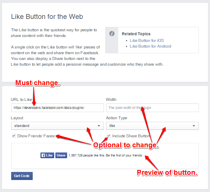
As you can see from the screenshot below, there are some options that you can choose to enhance the Like button. But they need to be weighed against how much space the button takes up. For example the first set of options makes the button (and all its attributes) really big. The space you want to put it in may not be big enough to hold everything, and it will cut part of it off. All of the attributes are optional, except for your Facebook Page URL.
A Quick Note: The “Width” option will not increase the size of the Facebook Like button (which is quite small). Instead the width controls the overall width of the Like button element. For instance, in the example above, the Like button element area covers the Facebook Like Button, the Facebook Share button, and the words describing the number of likes. So, increasing the width would only increase the space around the entire button set.
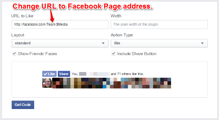
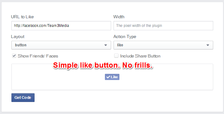
The screenshot below shows my Facebook Page address (or URL) in the text box below “URL to Like”. To find your Facebook Page URL, go to your Facebook Page and copy and paste what’s in the address bar into the top-left box (as shown below). That’s step one.
The next step is to decide what you want the overall button to look like. I’ve already talked about how the default set of options gives users a lot more information, but makes the button much bigger in size. I’ll explain that extra information, and go through the rest of the options, with screenshots below.
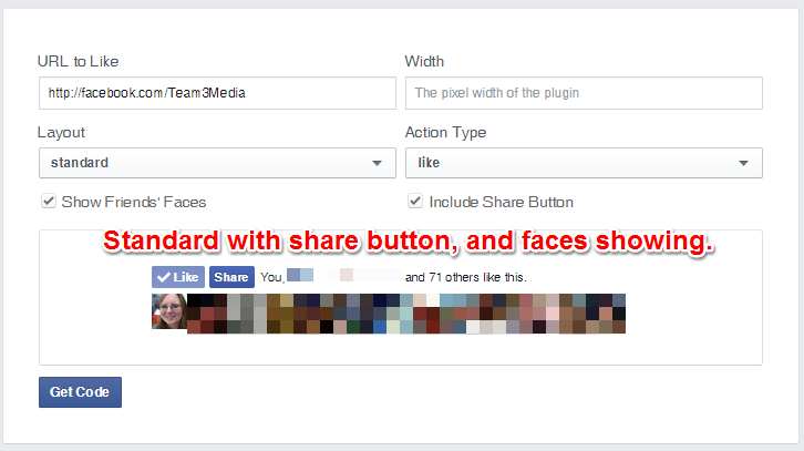
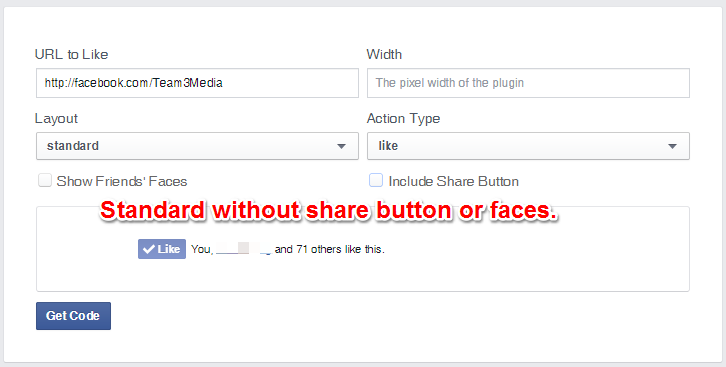
The first set shows the like button in the “Standard Layout” which adds the additional information of the person’s friends (the name here has been covered up for privacy reasons) who Like the Page. This is great for showing “social proof”, which can help your Page seem more Likeable, especially if you have a lot of Likes already. If you have a smaller number of likes though, I’d suggest going with one of the other options. You can also see below that there is an extra button (the share button) and that there are faces shown in the screenshot below. Most of these have been covered up to protect the privacy of people, but I left my own mugshot there, so you can see an example of what they will look like.
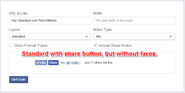
If you uncheck the “Show Friends’ Faces” option, it makes the button are look cleaner. This option works well for those who don’t want the added space the “faces” take up and for those who don’t necessarily care about social proof.
You can, of course, disable the share button. Since you’re trying to get people to Like your Facebook Page, adding a Share button only confuses the issue.
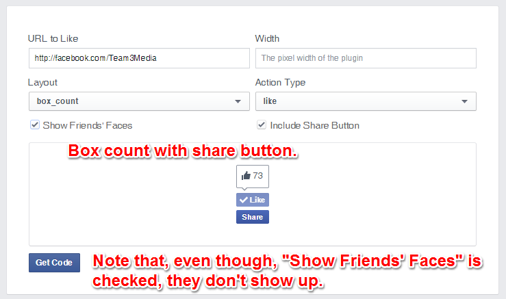
The next layout type is the “box_count”. This displays the Like button with a Like count over it, and everything is stacked on top of each other in a, you guessed it, “box” configuration. This layout, and in fact, the rest of the layouts do not show faces. So, if social proof is important to you, go with the standard layout or the Like Box (which I’ll cover later). This option works for those site designs where a more square or vertical section is available to place the button in. It’s also good for those who want to still show off the number of likes they have.
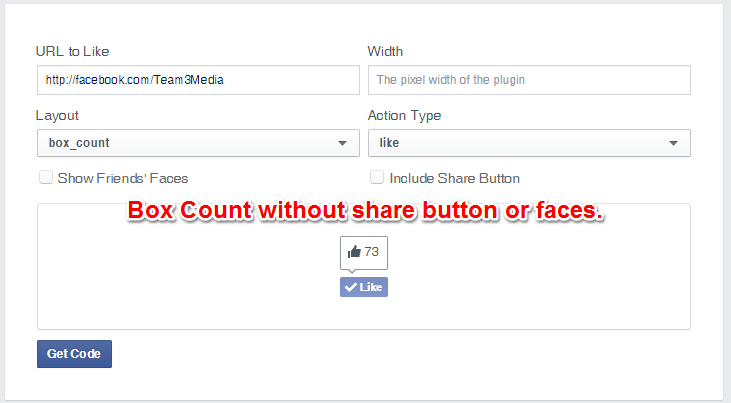
Since the box count does not come with the option to show faces (even if you check it), the only other option here is to take away the Share button. This makes the button into a nice compact design that could fit almost anywhere.
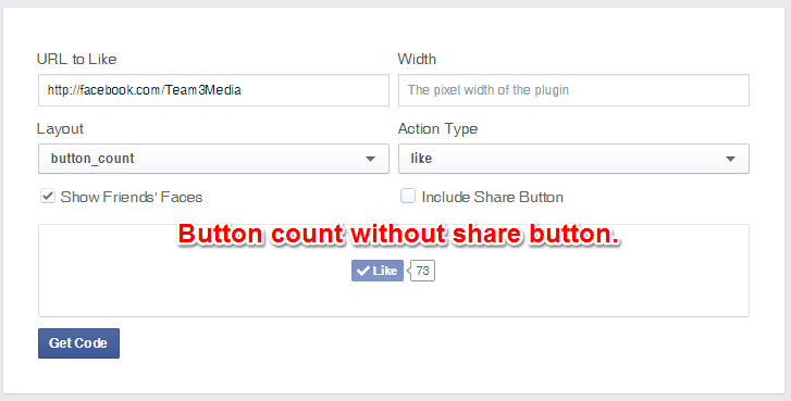
The next layout type is the Button Count. This layout is much like the box count layout, except that the number of likes is on the side instead of on top. This makes this button much more suited to a horizontal space.
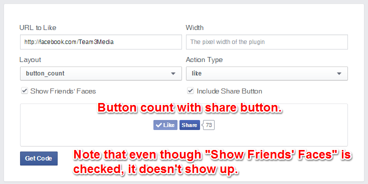
Of course, once you take the Share button away it will fit into an even smaller space. Again, this type of layout with the number of Likes showing appeals to those who want to use social proof to encourage more Likes.
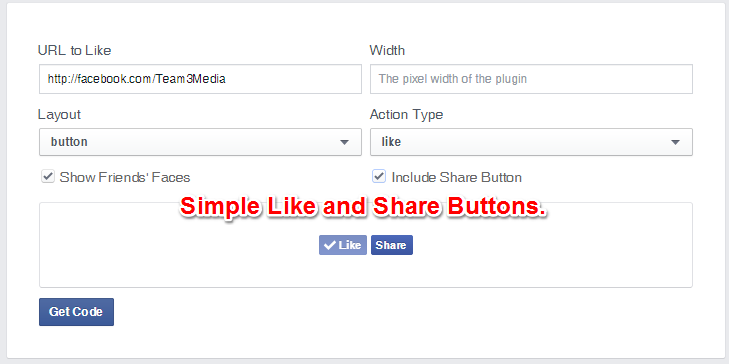
The last layout type is the simplest. That’s probably why it’s called the Simple Button layout. It is not only the smallest, but it’s also a great option for those Pages which have a smaller number of Likes, and don’t want to advertise that fact. This button, too, can be combined with the Share button, if you like.
The version without the Share button is tiny, minuscule even. This means you don’t have to worry about where the button will fit.
Warning: Code Ahead!
A quick warning: this next section involves some html no-how. If you don’t know what you’re doing, forward this article on to your web developer or admin and have that person complete these steps.
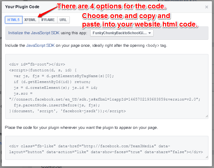
Now that you know which button types are available, take a moment to choose which is right for your site. Then, click on “Get Code”. You should see a box like the one below pop up. As you can see, there are 4 options for the code. I bet you thought you were done with options! We are almost done, I promise. 😉
The first three options require a little bit more work to install them and give you some more options for how much information you get when someone presses the Facebook Like button from your website. However, they are not necessary, in most cases.
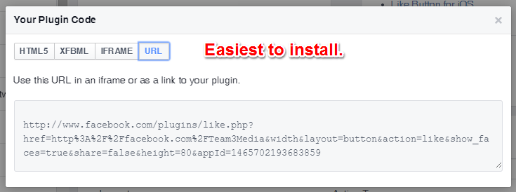
The easiest code type to use, and the one that will not bog down your site is the “URL” type. Which is just as it sounds, it installs a URL, which points directly to your Facebook Page, but has the added benefit of allowing someone to Like your Page with one click! Woot! Your next step here is to copy and paste the code into the html of your website where you want the button to appear. Again, if you don’t know what you’re doing get someone knowledgeable to handle it for you.
Alternatives to the Facebook Code
There are some alternatives to just grabbing the code off Facebook. If your website is on WordPress, then there’s several options in the form of “plugins” you can install with no programming knowledge. I won’t detail all the options here. Just make sure to check out the number of stars each of these plugins has, check out some of the reviews, and make sure it’s compatible with your version of wordpress before you install.
There are also plugins for drupal, joomla, wixia, and other website builders or (content management systems). Just use Google to search for them.
Whether you choose to grab the code from Facebook, or use a plugin, installing the Facebook Like button is just one way that you can increase your Facebook Page Likes.
Likes Are Just the Beginning
Remember, though, that Facebook Likes are only the first step in the journey. It’s great to say that you have 1,000, 10,000, or whatever number of Likes, but it’s not your end game. Those Likes represent real people who (hopefully) want to buy from you. Even if they don’t want to buy from you, they have indicated that they’re interested in your business in some way. Now it’s your turn to give something back to them. Give them a reason to read your posts, and keep them coming back for more. This is the way that you start cultivating relationships online that lead to sales.
- The Basic System to Rock Any Social Media Platform Part 1: The 3 Phases of Social Media Success - October 26, 2015
- I’m leaving on a jet plane… - August 4, 2015
- UPDATED: Tutorial Infographic: How to Add An Admin to a Facebook Page - June 10, 2015

